Tuesday, March 27, 2018

Pretty Weird Art 90's Comic Book Review #3: Uncanny X-Men #300

Issue: The Uncanny X-Men 300 
Publication Date: May 1993 
Writer: Scott Lobdell 
Penciler: John Romita Jr 
Inker: Dan Green
  
Story Synopsis
The X-men are investigating the kidnapping of Moira MacTaggart, a long time alley of Charles Xavier. They believe the Acolytes, pseudo-religious followers of a recently deceased Magneto, have abducted Moira and absconded with her to a remote location in France. The Acolytes torture Moira searching her mind for secrets pertaining to Charles Xavier and Magneto’s past while the X-men prepare to storm their location. A confrontation ensues between the X-Men and the Acolytes which tests the metal of individuals on both side of the conflict.

Writing
I found the writing in this issue to be excellent. Nearly everyone in the story struggled with an internal or interpersonal conflict which complemented their external actions. The plot was action oriented but it had beats of pathos and emotion woven into each fistfight. All of the core heroes and villains were given character moments which further developed their personalities and each received a panel or two that showed them at the top of their game. It’s an amazing feat of writing that each major character was given at least one moment to shine with their mutant powers. No one was shortchanged.  Each of the X-men and villains received at least one panel of artwork that showed them using their mutant ability in a visually dynamic way. My only complaint is that the Acolytes dialogue bothers me a bit due to them being turned into more of a religious cult rather than an extremist political movement. I’ve seen far too many writers use religious terminology to stereotype people of faith as brainwashed psychopaths. I wish that there had been a counter-weight moment to contrast their verbal religiosity with the Christian faith of Nightcrawler. Other than that gripe, the writing was top notch. 

Art
I have a bone to pick with X-men cover art. It’s lazy. Lazy covers are epidemic to the entire line of 90’s X-men comics. Just about every X-Men comic in my long box collection is either a flat shot of the title characters with minimal environmental details, or a cropped scene of several characters fighting with the camera zoomed in just a little too close to the action. Rarely are there any concepts to the covers. Rarely does the cover ever tell a story.

 I recently purchased about 250 Fantastic Four comics as a gift for a friend and was astounded at the story telling displayed on that series' covers. Every issue’s cover seemed to have a concept behind it to sell the book’s narrative. It would be an interesting experiment to take several 90’s X-Comics and to re-illustrate the covers so that they sold the concept of the story instead of pin-ups of the main characters.
Despite my gripes about the cover art, the interior pencils by John Romita Jr are as well done as the writing. His page layouts aren’t splashy, but his brush strokes and inking style are gorgeous. He has a different inker this issue that the last issue I reviewed, but I can’t tell a major difference. The entire story takes place during a rain storm which adds some wonderful atmospheric effects to the key scenes. The constant rainfall also frees Romita from having to draw background details in every panel without coming across as being lazy. I absolutely love how John draws his men. He was born to draw Bishop, Colossus, and Wolverine. His inking style lends itself well to depicting hairy or metal-clad men. He even cuts loose with some looser impressionistic inking on the building architecture in the smaller establishing shots. 
 
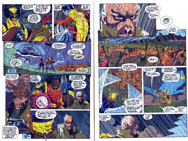
Mob Scene in the Rain 
Professor Xavier confronts a mob. I love this sequence. The rain effects and inking add an extra layer to the scene. It’s a great character moment for Professor Xavier to shows him both as a compassionate man, but also a man that is taking drastic actions that are chipping away at his character.
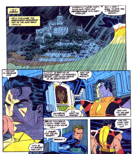
 Inking Technique on Architecture and Anatomy
Inking on the establishing shot of the castle and Colossus’s face is top notch and adds an extra layer of visual interest.


 Bulky Anatomy & Well Written Character-Driven Dialogue 
The beat between Archangel and Bishop is excellent. It gives the viewer a nice pinup up the two characters, while the dialogue expresses Archangel’s personality as he comments on how Bishop’s personality has altered Professor X’s personality(!) I also love how John draws big, beefy tough guys. They all look like they should be co-stars in the movie Predator.


 Strategic Narration to Add Additional Emotional Impact to Visuals 
The scene where an innocent bystander is murdered is powerfully rendered and written. The added narration in the 2nd to the last panel adds even more "oomph" to violence.


 Fun Banter
 I love the background patter between Archangel and Iceman. 


 Well-Written Dialogue for Character Moments & Visually Engaging Inking Technique 
Jean Gray’s moment to shine in the issue was fun. She quips about her enemy looking like Mephisto’s child and then gives an awesome display of her mutant abilities. We also see another great panel of impressionistic inks used to depict architecture. 


Strong Visuals to Augment Strong Emotions & Dialogue  
The last few pages of the comic feature an epilogue penciled by Brandon Peterson. While I’m not a fan of his art, the last two pages are very effective when married with the narration. Turning out the light in the last panel is a nice use of visual symbolism of a character’s impending death. 


Monday, March 26, 2018

Pretty Weird Art Comissions

Even though Pretty Weird Art isn't in the convention circuit this year, we're still making time on the weekends to work on commissions. Here's a few examples of a few recently completed ones. If anyone's interested in one, shoot us an email at prettyweirdart@gmail.com and let's chat. 


Sunday, March 25, 2018

Pretty Weird Art 90's Comic Book Review #2: The Uncanny X-men #299

Comic: The Uncanny X-men #299
Published: 1993
Writer: Scott Lobdell
Penciler: Brandon Peterson
Inker: Dan Panosian

Story Synopsis
The issue begins with a 4 page interlude following the X-man Forge as he investigates the ruins of a an orbital space station that has crash landed in the Kuwait desert. The space station belonged to the mutant Magento who is believed to be dead, but evidence of his demise is inconclusive. The comic then segues into Professor Xavier engaging in a televised debate about the state of human/mutant affairs with Graydon Creed and Senator Kelly. Various x-men and villains are shown reacting to the debate which concludes with a mini debate between Beast and Graydon Creed. 

The Art & Writing
 Normally I would analyze the artwork and writing separately, but for this issue, I think both need to be addressed simultaneously. This comic is probably one of the most difficult assignments that a writer could have handed to an superhero artist. The entire story is dialogue driven. There isn't a single action scene. All the superheroes are in civilian clothing. There are limited scene changes. The writer creates an interesting visual hook for the artist to utilize, using television screens in various locations to cross back and forth between the actual debate and characters reacting to the debate, but that hook isn't enough to make the story visually interesting. The visual heavy lifting has to be done by the artist to make the hook effective and I feel that Brandon Peterson wimped out on this issue. 

I get the impression that the penciler was bored with this issue, so he turned in passable, but bored artwork. The end result is a bored reader. Once the debate gets going, most of the issue's panels feature head and shoulder shots of various characters (all with the same chin line and pursed lips) talking in profile or head on views.  Backgrounds are pretty minimal. Brandon's art style seems very similar to Rob Liefeld's drawing style. Imagine if Rob drew a comic without a single action scene and you probably have a good idea of what this comic reads like.

 It's a shame that it came out the way it did, because a character on one of the final pages states that the televised debate was supposed to have been a very significant water-shed moment in the world of the X-men. Instead of coming across as being a momentous event, it came across as being a forgettable, "very-special episode" of your favorite 90's comedy sitcom. If the artist had been willing to spend a little more time and effort to change up his flat shots, add some dynamic lighting, or design some unusual page layouts, he may have been able to make this a visually dramatic issue. As it is, he just made an issue a reader thumbs through and places back on the shelf due to the walls of dialogue and flat story telling.


Bland!
As a reader, I look at this page and see reading it as a chore. The visuals are simple and bland so I have nothing compelling me to read the wall of text on the page. When I see this type of page layout, my brain starts to skim read by default.

Visual Hook 
Here's an example of the visual hook of the television screens being used to show the debate and people's reactions to the debate. In concept, this is a solid hook. In execution, it just feels like an excuse to draw more squares with heads in them. 

Look kids! More heads and shoulders (with the same chins and pursed lips) and minimal backgrounds!!!
Comics are awesome!

Archangel's Scene 
The only scene that I found visually compelling in the entire comic was the two page sequence showing Archangel's interaction with a nun while the debate plays in the back ground. 
The scene used dynamic lighting, shifting camera angles, and strong establishing/ending panels to create en engrossing scene. I love the last panel. It's beautiful. 


Beast's Mini Debate (with man making painful bowel movement)
The only other scene in the comic that left a lasting impression showed a sarcastic Beast blowing a raspberry at Graydon Creed (who appears to be passing a rather painful bowel movement) on live television. Beast's facial expressions match his dialogue and it's funny to see a serious character act against type. 


Saturday, March 24, 2018

Pretty Weird Art Poster: Horror Icon Poster


I realized I had several sketches of movie monster characters from last year, so I spent some time over the last three weeks to work them into a single, somewhat gory poster featuring horror movie icons.

I plan to make a few 18 x 24 posters. If anyone is interested in one, email me at prettyweirdart@gmail.com. 
 Posters are $30. 

Thursday, March 22, 2018

Pretty Weird Art 90's Comic Book Review #1: Uncanny X-men 287


Why is Pretty Weird Art reading 1990's comics and writing nerdy reviews about them????

Well dear reader, there is an explanation. 

Despite my life-long love of comics, there was a time period when I was rather ashamed of my interest. I felt like it was a very shameful thing for me to be seen reading comics in public past the age of elementary school. I filled reams of childhood sketchbooks with comic book ideas, but largely backed off from reading mainstream comics for most of my middle and high school years. It wasn't until I enrolled in graduate school to study illustration that I found the courage to dip my toe back into the hobby in a public manner.  I missed out on reading most comics that came out in the 1990's and early 2000's. I've heard all sorts of terrible, hyperbolic statements about the quality of the writing and artwork from the comics of that time period, so my curiosity has been peaked. 

 Recently two comic book stores in my hometown closed their doors. Before doing so, they had some ludicrously good sales on comics which allowed me to buy several long boxes of 90's Marvel publications. I thought that it might be a fun exercise to write a quick review of the artwork and writing exhibited in each comic as I read it.  My goal is to catch up on the comic book culture that I missed out on during my younger days, and to try to glean some story telling skills from each book that I read so that I (and you) can put them into use in my (and your) future creative projects.

 Comic: The Uncanny X-men, Issue 287
Publication Date: April 1992
Writer: Jim Lee & Scott Lobdell
Pencils: John Romita Jr.
Inks: Scott Williams

Plot Synopsis: 
 The story follows a team of time-displaced mutant policemen (the XSE) who are trying to thwart a jail break from the future. The team lead by Bishop engage the escaped criminals in a bloody firefight that attracts media attention and ultimately the X-men. The X-men confront Bishop as he attempts to capture a time-hopping mutant named Trevor Fitzroy. Initially they view Bishop as an adversary, but by the end of the issue, the X-men accept him into the fold as one of their own. 

The Writing:
The story is credited to both Jim Lee and Scott Lobdell. I think I can tell which contributions each of them made. The story is mostly centered on action scenes during which characters explain their backstory and motivations. I get the feeling Jim Lee plotted the pace of the action while Scot Lobdell tried to find places to plug in backstory exposition. There were a few pages that had some witty narration and action-movie banter between characters that I found enjoyable and memorable.

The Art: 
I really like John Romita Jr's drawing style from this era. All the men have barrel chests, square jaws, and brandish fictitious rectangular firearms. Something about how he draws lips and mouths in this issue really stands out to me. You can tell the character's emotions solely by looking at the shape of their mouth; there's no need to look at any other facial expressions. There's also some amazing chunky brushwork in the inks. I'm not sure how much of that credit should go to John or Scott Williams. There are some key scenes involving Colossus and environmental situations that really pop due to the chunky brushwork. They do wonders for implying reflections and atmospheric effects.


 Page 1: Witty Introduction
The narration on the first page manages to introduce the plot, a new character, and the writer's sense of humor in quick succession. I love the last 3 narration boxes for their cheeky humor.

 Page 2: Witty banter & Page Layout
The sense of humor continues on the following 2 page spread. I loved the quip about the quotation from "The Wit and Wisdom of Henry McCoy". The dialogue in the first three pages effectively explains who the main characters are, their motivations, and the plot conflict. The laser blasts on the page layout creates a triangle off center to the staple margin which keeps the viewer's eye roaming around the page while also pointing the viewer to continue reading on page 3.


 Page 9: Chunky Inks 
I love how the chunky inks are used to both simulate a reflective surface on Colossus and also wood texture on the floor he's crashing through. I've got to remember this trick. The looseness of the brush strokes also add a more dynamic visual texture to the panel.

 Page 14-15: Panel Flow, Layout, & Character Designs
This two page sequence had a nice flow to it. I especially like how the right page has the characters literally running from one panel into the next. I also like the uniforms that were designed for the XSE soldiers. The red bandanas are reminiscent of old west cowboys and Bishop's over-the-shoulder shotgun holster reminds me of the colonial marines from the movie "Aliens".


 Page 17: Chunky Inks & Negative Space
The loose, chunky inks combined with negative space and simple coloring really stood out to me on this page. 


Page 29: Depiction of Sensory Effects
The bottom half of this page really sells the "cinematic quality" of comics. The artist is able to re-create the tangible sense of blurry eyesight coming into focus through the effective use of simple color and diminished surface detail.